Odds are, you read an email on mobile today. Probably even a few.
Mobile is now a standard vehicle for email. Studies show mobile users account for anywhere from 41.9% to 62% of email opens. And marketers know this number is only getting bigger.
What’s more, 62% will delete an email if it’s not mobile-optimized. Clearly, subscribers have little patience for emails they can’t read or interact with!
All this to say, if you want to succeed at email marketing and increase your engagement rates, designing mobile-first emails is a must. So in this article, we’ll cover mobile-first email design principles, including quick tips, practical guidelines, and common considerations.
But first, let’s take a closer look at the definition and advantages of a mobile-first mentality.
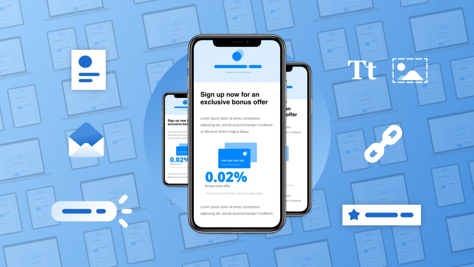
What is mobile-first email design, anyway?
Mobile-first email design flips the script. Or rather, screen size.
Instead of designing for desktop first, you start by designing a mobile version. There are a few advantages to this approach:
- Mobile-first design doesn’t just look good on mobile. Mobile-optimized content looks great on desktop and on a global level. Why? Because it’s much easier for providers to adapt a mobile-first design to larger screen sizes than the other way around.
- Mobile use is growing while desktop use is shrinking. As I mentioned earlier, the number of emails being opened on mobile is only getting bigger. So a mobile-first approach is a good move for today and tomorrow.
- Mobile-first design puts customer experience first. In today’s highly competitive landscape, customer experience is everything. And one bad experience is one too many. In fact, one study found 52% of users would be less likely to engage with a brand after a bad mobile experience.
Convinced? You’ll be glad to know moving to mobile-first email design doesn’t have to be a huge ordeal.
Read on for what to do — and what not to do — when designing emails for mobile.
Top 5 mobile-first email design principles
1. Optimize CTA buttons and text size.
The biggest difference between mobile and desktop is screen size. Laptop screens generally range from 11 to 15 inches or more. In contrast, smartphone screens max out at around six and a half inches.
To provide a good experience on such a small screen, you need large buttons. Readers should be able to easily click-through with their thumbs. Text is often way too small for mobile too. Ideally, text should be at least 15-18 pixels and headers should be around 22 pixels.

2. Take stacking into consideration.
If your content isn’t optimized for mobile, readers may have to scroll horizontally to follow text off-screen. Images may also be cut off in strange places. That’s a bad user experience. Not to mention, awkwardly rendered content reflects poorly on your brand.
To avoid these issues, use a clean, single-column layout with a vertical orientation. This type of email layout scales well on any screen. If you include in-line links, you’ll also want to consider how they stack. Make sure there’s enough space between your links that users can easily tap the right one with a thumb.
3. Keep email size in check.
If your emails are too large, they’ll load slowly on mobile. And as we’ve seen, readers aren’t especially patient! Some 40% of people will abandon a website if it doesn’t load in three seconds. In all likelihood, email has a similar grace period for loading.
So keep load time in mind when designing your emails. Stick to a reasonable length, use images sparingly, and check image size for the ones you do use. By limiting the length of your emails, you’ll also reduce the chances of your message being clipped.
What about interactive email content? It’s true, users expect interactive functionality. But try to avoid “too much” of a good thing. Opt for one or two interactive elements, instead of three or five. You’ll increase your chances of getting your emails read. And your emails won’t be too overwhelming either.
4. Use text and images, not image-based text.
There are several problems with putting text on images and using those images as the content of your email. Accessibility, for one. Two, on smaller screens, image-based text may become illegible. Plus, some email clients block images by default.
Image-heavy emails may also be slow to load, or fail to load altogether. All this means your subscribers may never see your message. Instead, use text for the main body of your message and add images that complement your content.
5. Link to mobile-friendly websites.
Think through the entire email experience. If a subscriber clicks through to a site that’s not mobile-friendly, chances are they’ll think twice about engaging with your emails in the future. They may even unsubscribe.
Make sure the sites you link to load quickly, look good, and provide an overall positive experience on mobile. Otherwise, all your efforts to design mobile-friendly emails will be for naught!
Bonus tip: Make the most of your subject line and preheader.
Your subject line and preheader text are responsible for drawing subscribers in. So you’ll want to optimize these elements for mobile too. Depending on their mobile email client, subscribers may see anywhere from 33 to 43 characters.
To avoid having your subject line cut off, stick to 30 characters or less. If you have to exceed this character count, be sure to put your important information first.
But remember, you also have your preheader text to work with. You have a little more leeway here. Mobile devices display on average 35 to 50 characters. Use this space to elaborate on your subject line, add personalization, and seal the deal.
Test, before you hit send
Followed all the guidelines above? There’s one last step before you hit send…
Testing. For every email you send, device testing should be a non-negotiable part of your workflow. That includes marketing email campaigns and transactional email templates.
Testing is the best way to ensure your content will render properly, whether your customer uses an Android, iPhone, or Google Pixel.
How can Dyspatch help?
I’m glad you asked!
When you create templates in the Dyspatch email builder, they’re mobile-friendly and responsive by default. It’s all thanks to the Dyspatch Markup Language (DML). Think of it as our “secret sauce” for responsive emails that never break.
With integrated Litmus testing, you can also preview what your template will look like across hundreds of devices, email clients like Gmail and Apple, and even in dark mode. So no matter where or how your subscribers view your emails, they see what you want them to see.
And you can send with confidence to every device, every time.
Originally published: March, 2018. Last updated: June, 2021.
An edited version of this article originally appeared on MarTech Advisor.