Domino’s is an iconic brand, synonymous with my favorite food ever: Pizza. Some traditional brick and mortar businesses get a bad rep when it comes to email marketing, especially franchise-based models. The good old red blue and white, on the other hand, is doing an amazing job of staying relevant and true to the brand. Let’s dig into this iconic brand and see how they’re executing on email.
Email Mouthfeel (™)
Bite sized takeaways
- An iconic brand like Domino’s can combine 3 simple colors with spacing, large font sizes, and alignment tricks to create a really engaging email
- If you have a loyalty or points program, elevate that to the top of your email and give your customer ways to action on it
- Use a dynamic repeating background image to add some punch to your designs
- More is sometimes better, when it comes to call to actions, but use color to set information hierarchy
Email mouthfeel
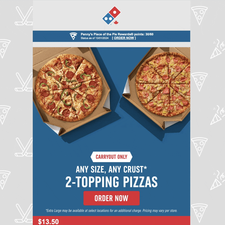
What’s the mouthfeel of an email? It’s me stretching an analogy to match the theme of Domino’s email. To be clear, Domino’s has a great overall structure and theme to their emails, and they do two things very well. First, Domino’s hard commits to their iconic brand colors: red, white, and blue. Blue is predominately used as a background color for their single column layout, whereas their unique red and white are used as highlights for text and calls to action.
Second, Domino's has opted for an awesome party-themed repeating background image. In this case, it was Hockey Night in Canada, which would explain the background of hockey sticks and pucks. I’m looking forward to receiving this email in the spring, when I hope the background will swap for something to match the season. Background images like these are largely “set it and forget it” but I think they’re a small touch of personalization that can really delight a customer.
Domino’s theme in Dyspatch
Rewards, rewards …

This subtle puzzle piece slips in just under the logo, though it is one of my favorite parts of this email. Many brands track loyalty points and rewards status, but so few highlight it in customer communications. I love that Domino’s puts this at the top of their email.
This really could have been enhanced by highlighting some available rewards or by adding a way to leverage those points today. Can I get a free 2L soda with my order if I use points? Maybe I can add a second large pizza to my order using points only? That’s what I really want to know! Herein lies the challenge for many marketers: sending data-driven emails is hard and often requires an email developer. Kudos to Domino’s for adding the points total. Fingers crossed they double down on the investment!
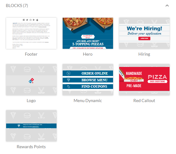
Nuts and bolts, this iconic brand goes modular
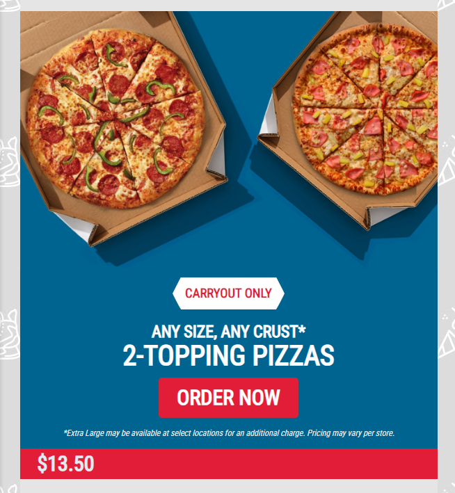
I really have to hand it to the email marketing team at Domino’s, they’ve adopted a modular design for the emails that really plays to their strengths: Pizza looks amazing. In this email we have the same hero module used 3 times, with different variations of component positions and text size. It’s great to see a brand practicing what we preach (modular design).
One criticism of Domino’s approach is that each hero is composed of 2 images, including their text and buttons. This is a major bummer because without images enabled, this email really doesn’t hit the mark – the recipient will see a long, blank email. In rebuilding this email in Dyspatch, we made the choice not to create this as one huge image. The benefits are that we can make changes to everything on the fly, no designer required, and we can ensure the email scales down to mobile really easily.
Left aligned pricing?
I would be remiss if I didn’t discuss the decision to have pricing left-aligned in the column, while the rest of the text and calls to action are center-aligned. I’d love to know if there was testing or analytics behind this decision and it performed better, or if there was another reason for this. Visually, the red horizontal section is striking and is a great way to break up the email.
Menus? We’ve got those.
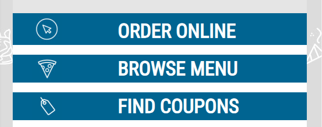
After the repeating hero modules, Domino's includes this great little menu. I love the choice of the full column blue bar being a clickable button. Visually it really reminds me of a menu I might find in a mobile app. It’s a great touch.
If I was talking with their email marketing team, I’d suggest including a mini menu in the header as well, maybe just leveraging these icons to also help customers find their way.
Atouch that any marketer will appreciate is how Domino’s speaks to price sensitivity without saying “free” or “20% off” etc. “Find coupons” is a great way to entice a click, but it’s not included in the first ⅓ of the email. Domino’s knows they have a great product so they don’t have to race to the bottom of the pricing barrel right away. I thought this was a great, tasteful way to include this in their email.
Speaking of differentiators…
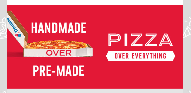
I bet if you hire an MBA-toting agency expert to analyze the takeaway Pizza market, one of the things they’ll bring up is the emergence of “pre-made” pizza delivery companies. It’s hard to ignore the business efficiency that this creates, but I love Domino’s fighting back with “Handmade over pre-made” .
Domino's knows it’s important to remind customers why their pizza is so great, and even if you don’t click through to the info page, it’s still a great reminder and visually breaks the email up.
We’re almost done
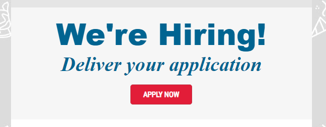
Before we get to the ever important footer, Domino’s has a quick reminder that “Hey, we’re hiring!”. Personally, I’m a big fan of play on words, so the invitation to deliver your application really tickled my fancy.
From a design standpoint, this block uses a slightly different light grey background, which helps the reader know this component is important, but not as important as what came before it. As a company that is constantly hiring thousands of people, I think it’s smart for the Domino’s team to pack in one more call to action before the footer. Email marketers are often reluctant to give up email real estate to tertiary links, but I’m of the opinion that you never know what will entice a user to click. As long as the call to action aligns with your business goals, what’s the harm in testing it out?
Change is a foot….er
I did say I like puns.
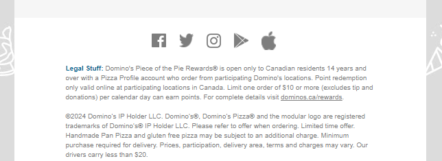
Two things I love about the Domino's footer that really set it apart: First, we’re seeing app (iOS/Android) links show up next to social links more and more often. Normally you see larger “install our app” icons, I like the subtlety here.
Second, and this is small but… the little Domino’s blue highlight of “Legal Stuff:”. That’s 🧑🍳
All in all this email is composed of seven (7!) simple modules, but you could argue it’s really six since the logo/rewards section are one.